Monday, January 26, 2015

Best Water Color Art Supplies I Use for Travel

Just wanted to share the art supplies I use to make my water color paintings- paints, brushes, paper. I have been making water color paintings for more than 20 years now, and have used all major brands of art supplies. I stick to using as less supplies as possible because 1. I am lazy, and 2. I want to pack light when I travel because I carry my art stuff all the time.

Here are the ones I swear by for the best effortless paintings:

Paint Supplies:
Camel Artist Water Color Tubes
These are not that expensive, but I use them for the colors I don't use enough in my paintings, like browns and greys (I like to use greens and blues more).


Green, Blue and Red Water Color Paints:
I love the Windsor and Newton's Cotman Water Color tubes. They're my favorite water color purchases till date. I have two in prussian blue 538, because I paint skies and waters so often, and one of Sap Green 599 and Alizarin Crimson Hue 003 each, I use 8ml, but here's the link I found for 21ml Cadmium Red:
Winsor & Newton Cotman 21ml Water Colour Tube - Cadmium Red Hue
They give absolutely brilliant tones that brighten up my paintings.


Brushes:
I have a mix of round, flat and fan brushes. I keep 6 brushes in my travel kit:
Blick Scholastic Wonder White Fan Brush #4 (I use this for flowers, clouds and waves)
Camlin Series 66 Round Paint Brush
Here's the link for Camlin Series 66 Round Paint Brush on Flipkart.com
Camlin #8 Round Brush (I use this for most of all my paintings)
#12 Flat Brush (I paint skies with this)
#6 Flat Brush (I use this rarely, for water waves)
#3 Round Brush (for fine details)

Paper:
I am totalllllyyyyy in love with this water color pad. I wonder why this is still uncommon. It comes with 20 sheets on 300 gsm, perfect for travel, and all medium-small sized paintings. I keep my paintings in it until I return from my travels and until I get them framed.

Best purchase ever: Fabriano Studio Water Color Pad


How to Make Stained Glass Mosaic Painting - 2

Contd. from my previous blog post "Colored Glass Mosaic Painting "

I had leftover glass pieces from the previous painting I hadn't used. They needed a painting of their own. These were mirrors, stained glass pieces in green, and colored glass pieces in blue. Here's the finished result and how I made it:

Choosing a Theme:
I wanted something inspirational. And the glass pieces were blue and green, so I chose a wishing tree. The idea behind this painting is simple- it's a wishing painting. We usually make wishes in wishing wells, or landmark bridges, or temples. But what if I had a painting in my own home that I could make wishes from, and be inspired by all the time?!

The concept was to make sort of a dual shape. It's a tree, but it's also a dancing peacock. Because essentially a peacock makes a wish by spreads its wings. It is wishing to look attractive to its prospective mates. So I thought the concept went well with my color choice and theme.

Planning the Layout:
Like the previous painting, I laid out several ideas on the floor first to choose from. 

Laying the Pieces on Glass:
After finalizing the shape, I laid out the pieces in the shape of a tree/peacock directly on the glass. This time, instead of placing them with edges parallel, I laid them out with corners touching and no parallel edges for more negative spaces in between. The pieces have an embossed floral pattern on them, so I needed to randomize them to make the floral effect as subtle as possible.
Sticking the Pieces:
Then I stuck them on the glass using the putty.
Filling the Gaps and Painting:
Then I filled the gaps with POP and colored it with acrylic metallic green and blue.

You can use a variety of metallic shades here for drama, depending on your theme. These are the ones I used- Camel Fabrica Acrylic Metallic Colors


Then I cleared the extra paint on the mirrors using my regular nailpolish remover and cotton balls.

I also painted the beak of the peacock with the blue metallic paint. Here's the finished result. 

Backdrop:
I needed to make a backdrop because there was lots of empty space behind. I also wanted to mix media in this painting, so I decided to paint a watercolor sky. 
It's sort of a cloudy rainy sky because of my peacock dancing in the rain theme. 
Next, I had to write the words "make a wish" at the top. I wanted it to have a typed out professional look. So I typed the words out in an MS word doc, trying a few different fonts and sizes.Then I printed them to see which size and font I liked the most. Then I went back to my MS doc, and made a pdf of the text, and flipped it horizontally in photoshop. Then I printed it out on a sheet of paper and laid it out behind my glass. 
Then I just easily traced them with a permanent marker on the glass. You can use a thick marker depending on your chosen font, but I needed one with a thin tip for the serifs of my font. This is the one I used - Camlin Permanent Marker in Black.

Framing:
That's mostly it. Then I got it framed with a matching blue frame with it's sky backdrop. Looks beautiful in my living room. 

Thursday, January 22, 2015

How to Make Stained Glass Mosaic Painting

Recently I came across a local glass mosaic artist who creates artwork for Indian temples. I watched him work, cut colored glass into tiny triangles and paste onto MDF using putty. I was very fascinated with the possibilities and got some pieces cut for myself. 

The theme I chose was shattering- glass. The glasses I used are:
- Red Saint Gobain Colored Glass
- Mirror

I lay them on the floor in different permutations to see their effect. 


Then I chose this pattern of red glass against mirror and extended it. 

I put pieces together like a jigsaw puzzle, matching ends but leaving 4 mm space between each for grout. I tried many different variations. When I was satisfied with the final design, I measured the area and bought a glass of that size. Then I stuck these pieces in similar fashion to the glass using putty. 


Then I made a paste of plaster of Paris and filled within the gaps.  

I colored it black using Camel Black Fabrica paint and a thin round brush. Then I cut off the extras of POP using a paper cutter. 
This was the most time consuming part, because removing the extra POP often resulted in removal of paint from the gaps, which I then had to refill using more fabric paint or permanent marker. I used a Camlin Permanent Marker in Black for this.


I also used acetone to remove the extra paint leftover on the glass pieces. And then I framed it. Love the way it reflects the crystal chandelier in the living room. 


Monday, August 4, 2014

Italy Trip and Painting

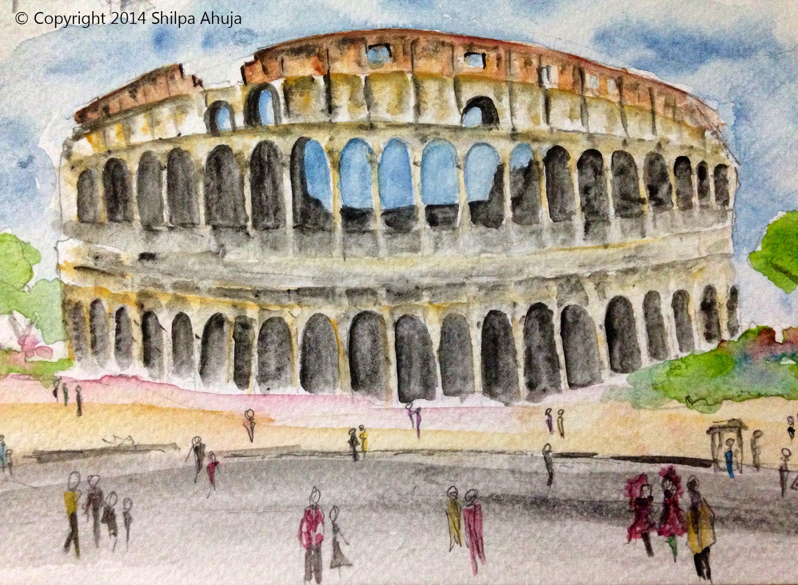
I recently took a trip to Italy that was magnificent and inspiring. I took along my water-color pad and paints, and painted some of what I had seen in Rome. Here's a painting of the Colosseum that I made there:

Sunday, April 6, 2014

My New Website

I've been making my portfolio website and am putting it up right now. Here's the weblink: www.shilpaahuja.com, which reminds me - this blog is now restored to its original weblink: shilpaahuja.blogspot.com.

I used my hotel lobby montage as its backdrop for the website, and the color scheme is black, gold and red. Check out the design with these screenshots:


Sunday, December 8, 2013

Logo and Business Card Design: Piamony Photography

My best friend Neena Majumdar has started taking up photography assignments and I had the honor of designing the logo, watermark and business cards for her work.

I designed this logo in May, 2013. The design is a simple text, with a sketched eye taking place of the 'o'. It represents the idea behind the photography studio- how each picture is more a work of the eye than the camera. It was inspired by her art and creativity, and her own sketches. Here is the final logo:
And here is one of her pictures with the watermark:


Just like the logo, I wanted the business card to look fresh and minimalistic, yet elegant, sophisticated and professional - something that complements the logo and text without overpowering it, while also steering clear of cliche ideas such as tripod, camera icon, etc.


A Piamony image of a revolving stool is used. This provided for a perfect background because of its focus, shadow, texture and greyscale-ness. The grey was extended to behind the text to make a light, sort of out-of-focus backdrop, almost like a wall, or even a handmade paper.


Here's the link to the Facebook page: https://www.facebook.com/PiamonyPhotography

Sunday, October 20, 2013

Scholarly Paper: Has the Recession Made Hotels any (un)Greener?

I wrote this paper in the final semester of my masters program at Harvard Graduate School of Design. It talks, as the name suggests, about hotels during the recession and the effect recession had on their eco-friendliness. 

For the purpose of this study, I considered what makes or defines a hotel as green, how costly and how effective would it be to build green hotels and whether or not the guests or users want to pay a premium for a green hotel over a regular hotel. 

I also talked to developers, hotel owners and green experts to see whether all the cost-cutting during the economic downturn has led to developers trying to invest more in green products and building techniques (for lower life-cycle costs) or invest more in other products (that may not necessarily be eco-friendly, but ensure lower initial costs). 

Consecutively, I researched on how the trend of the sustainable and eco-friendly buildings has been affecting the hotel industry in general. As far as commercial buildings go, saving the environment doesn't stop just at the building stage, but needs to go on during operations as well. 

I concluded by taking the example of the number of LEED-registered hotels and mapped out the trends in green hotel building during the last ten years, both in the US and worldwide, and also compared them for the big hotel brands too.


Here is an abstract of the paper:


ABSTRACT

Hotels and guests have changed over the last decade in terms of being eco-friendly. The hotels have begun to provide in-room thermostats, recycle-bins, shampoo and lotion dispensers. They have started educating guests on how much water and electricity they can save.

As customers are also getting more and more aware of sustainability issues and the world is trying to get greener, developers and building owners are increasingly turning toward eco-friendly buildings. 

While lagging behind a little bit, hotel developers considered it necessary to keep up with the sustainable movement. The last few years have seen the maximum growth in the number of LEED-registered hotels and eco-friendly hotel chains. Today most, if not all, of the luxury hotel brands in the United States have properties that are either going for LEED certification, or other green-hotel certification, or simply adopting green practices in their operations.

But at the same time, when the world saw an onset of recession, there came an increasing pressure from stakeholders and lenders to cut down budgets of all new projects, not excluding the hospitality industry. And while all this was happening, hoteliers still needed to cater to the demand for increase in the “luxury” factor from local and international travelers.

Therefore, this paper intends to be an analysis of green hotels and how the juxtaposition of the green movement and global economic downturn affected the hospitality industry. Overall, it will study these effects through a question “Did the recession make the “green” hotels any (un)greener?”

The paper covers topics on introduction and history of green hotels, green initiatives by hotels, costs of development of green hotels and whether or not the guests care. It then analyzes the number LEED-registered hotels in the US in the past decade, and the percentage they are of the total hotels built. The growth in the number of LEED registered hotels of most prominent hotel brands in the US has also been analyzed.

Such a study can find out, or attempt to find out, the discrepancy between what eco-friendliness means to the hotel developers and to the end-users and how that gap can be bridged. Also, an analysis on the effects of recession on hotels can help us understand how hotel budgets can be manipulated to help maintain their eco-friendliness. It can help developers draw on the theory “being green can also mean being profitable”.


Saturday, October 12, 2013

Bottle Painting Part-2

I painted this bottle for a friend, who wanted to preserve one of her bottles for personal memories. The bottle is The Glenlivet Single Malt Scotch. I was happy to see the bottle was a lighter green than the Cabernet Sauvignon I had painted before. This would mean the design on it is more conspicuous without back-lighting.

As before, I preserved the label, and painted with only a permanent marker. This time, I decided to base the design on the memories that my friend associated with the bottle. The whole design is sort of a collage of sketches, almost symbol-like, each representing a different memory, spun all around the smooth round surface. I wanted it to look like an abstract collection, that would be aesthetically pleasing and interesting to a viewer, but understood completely only by the owner, so that she could be reminded of a different memory each time she looks at it.

Saturday, February 2, 2013

Bottle Painting

When I started painting an empty wine bottle back in 2010, I was looking for a long art project that I could go back to whenever I had free time on my hands. And for that to happen, I needed something that would take many many hours. So I chose this intricate and symmetrical damask design. The bottle is a Californian Cabernet Sauvignon. 

The design was adapted from this lovely vintage damask fabric by Osborne & Little called Dryden Velvet. I think this design is absolutely stunning, and I wanted to take up the challenge of drawing symmetrically on the glass bottle, which is smooth and round, making painting very hard. The wine label and even the price tag have been kept intact.

I used permanent marker to draw this. Each and every line is a first draft and no other tools or rulers have been used. I often used to take the bottle to Harvard Square Starbucks and painted there. I didn't exactly count how many hours it took me, but I painted on and off, and the whole project has been going on for two and a half years now. Never knew I'd be that patient with anything.


I'll write about the second bottle soon!

Wednesday, June 13, 2012

Lowell House Oil Painting


Last weekend I painted the belltower of Lowell House on a small canvas.

Built in 1930, Lowell house is one of the undergraduate houses at Harvard, and located near my previous apartment. The Lowell house tower was originally designed as a clock tower, but after the house received a gift of authentic pre-revolutionary Russian bells, its design was converted to a belltower. The original bells have since been removed, and now the tower houses replica bells. The bells are rung on weekends, New Year's eves, Commencements and after we win football games.

This is my first non-absract oil painting. It took me 4-5 hours to paint this, two round brushes, and for the first time, more than three oil colors in a single painting! I also learned a lot about painting architecture with this one. 

Tuesday, April 17, 2012

Oil Painting in a Hotel Lobby


I combined my two loves, hotels and art, to create this montage that is a translation of my oil painting into a hotel lobby. So in case you were wondering how my painting would look as a wallpaper, here's your chance to see it!

Also, my newfound obsession with the ginko leaf shows here. (Let's pretend it's their logo, so its overuse would be justified.) I converted the black tree in the painting to a silver and gold leaf tree sculpture. It forms the center of the waiting area that has red swivel chairs around it. I also used a gold leaf chair. Red rugs with the ginko leaf pattern define the seating.

The reception desk is also gold leaf with the ginko leaf print embossed. The wall curves to form the ceiling. More gold painted ginko leaves form the cove lighting here.

Next, I'll work with this reception desk's shape.

Monday, February 27, 2012

Architectural and Travel Photography

I just realized that my blog is missing some important work - my photography! I love taking pictures and I love the camera. I wish I had a fancier camera, but for now, my Nikon L110 works!

Here are some of the pictures I shot with that camera while traveling...

This one is The Alchemist, a sculpture by Plensa at MIT, Cambridge:

HDR photo of Chicago from top of the Willis Tower. This was taken in Fall 2011.

Of course, Disney World, Orlando. Just loved how the sky was so dramatic like in an animated movie.

Grand Canyon- one of my favorite photography destinations till date!